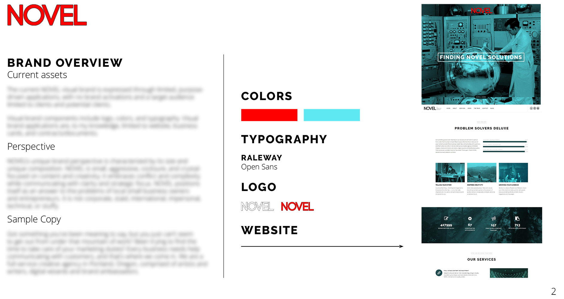
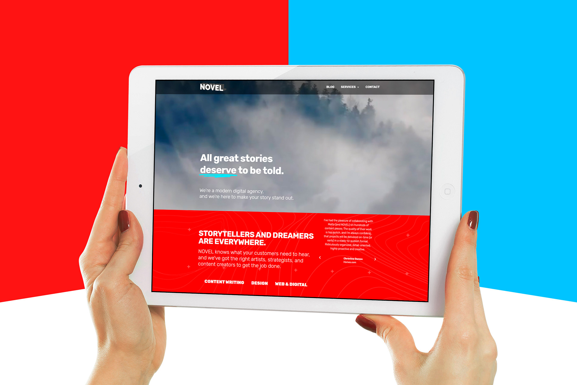
I work primarily with NOVEL as a graphic designer, so I jumped at the suggestion to re-envision their brand approach. In consultation with the company's principal, I conducted a brand inventory, made a series of recommendations (including a new brand story and related documents), and developed a new brand package. I also developed the company's new website (launched April 2019) and manage the brand on an ongoing basis.
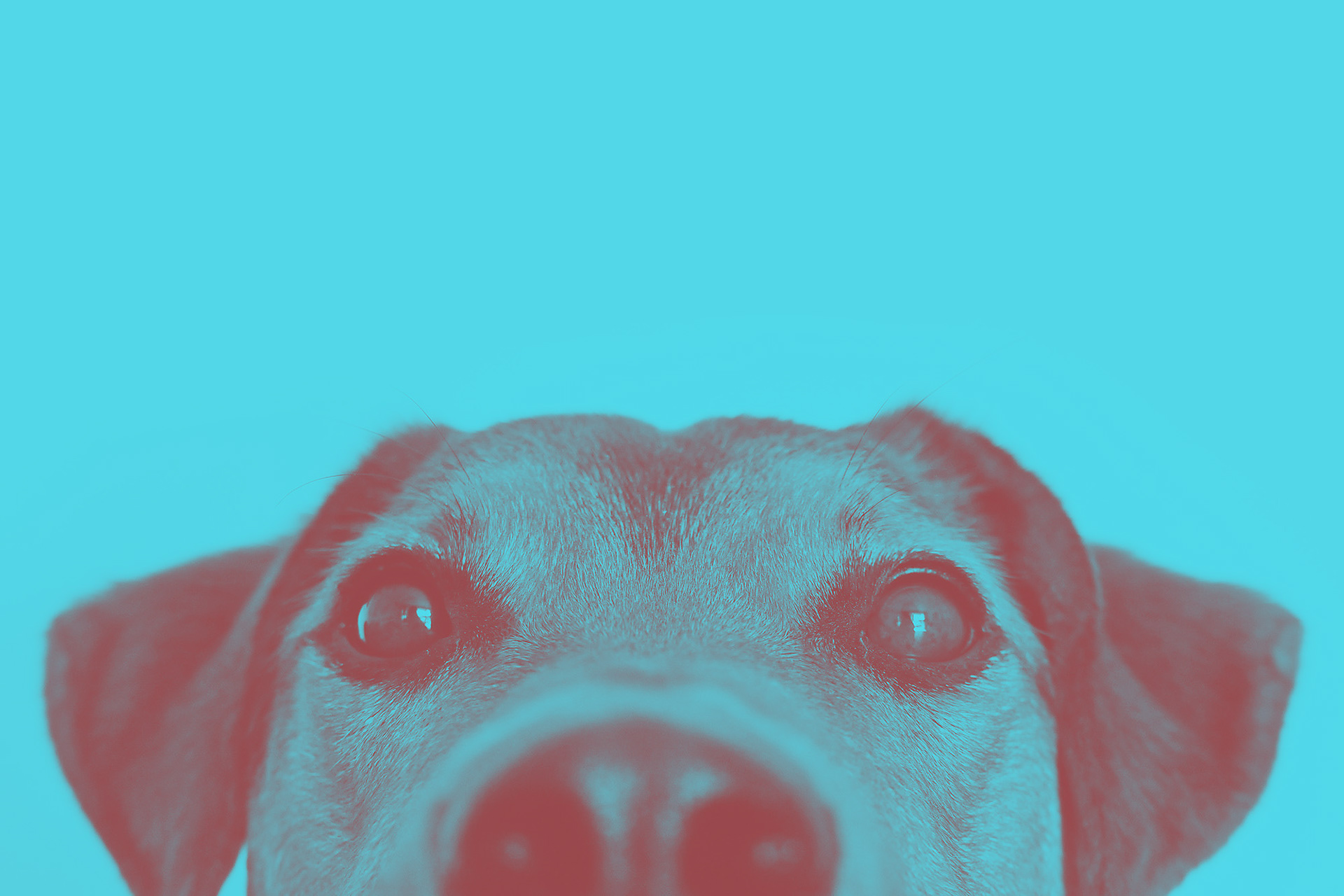
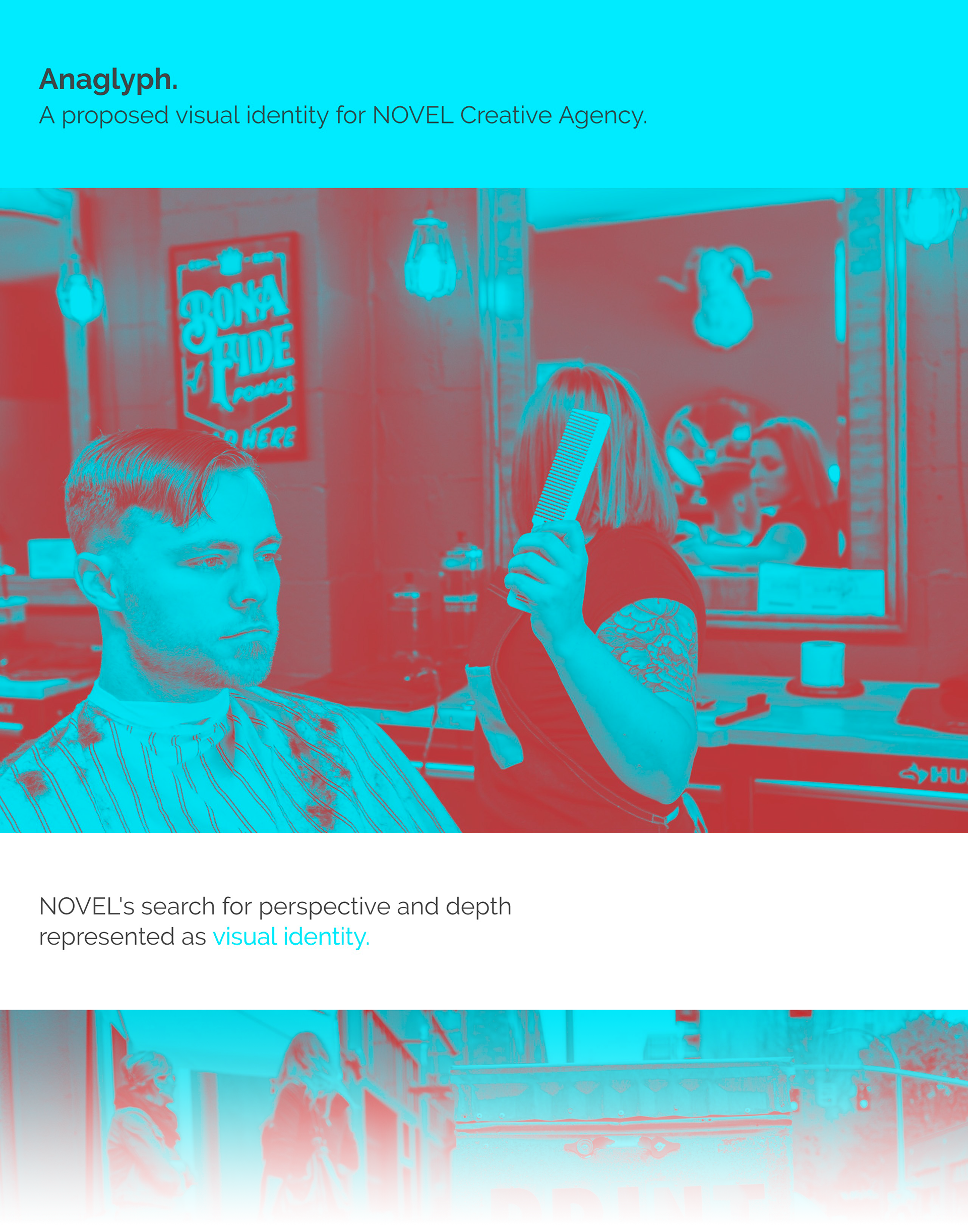
NOVEL's new logo is a visual departure from their old, but the overall package makes use of similar colors and themes, consolidated behind one concept: "anaglyph", the use of red-blue lenses to see 3D depth in specially prepared 2D images. NOVEL's core business is helping customers see new sides of the clients we work with, and I wanted to visually represent substance--shown through a perspective shift. (There's also a motion logo that sells this concept pretty well--take a look at the video down below.)
The brand is still being introduced, so keep an eye out for metrics and evidence yet to come--but I've been pretty busy since we launched, so I'm calling it a success so far!